Battle Of Twitter’s Third-Party Apps
Last week, Twitter announced the end of supporting Twitter for Mac. In response, Twitterriffic, a popular third-party application, immediately reduced the price of their Mac app to $7.99. Owning both Twitterriffic and Tweetbot, their main competitor for iOS, I decided to spend the weekend comparing both apps to determine which to use moving forward.
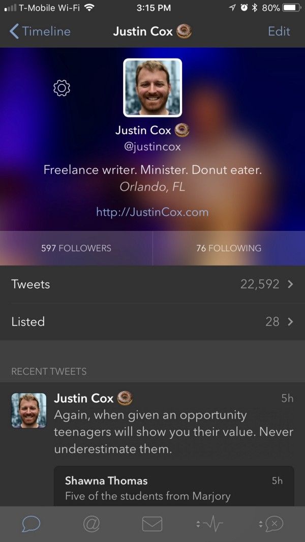

Third-party Twitter apps have several benefits over Twitter’s native application. Namely, a chronological timeline that isn’t infiltrated with random tweets your friends like. This alone is worth using either of the apps, but which is the better option? Let’s look at a few common features.
Mute Filters And Muffles
Both Twitterriffic and Tweetbot allow you to filter out tweets you don’t want to see using keyword filtering or regex formatting. The way each app handles muted tweets is a little different.
Tweetbot removes the muted tweets from your timeline. You see no trace of them. Twitterriffic will do this too if you set it that way. However, their default is to muffle the tweet, by collapsing it in the timeline. You can still see the user and reason the tweet was muffled.

Here, Joss Whedon’s tweet was muffled in Twitterriffic for violating the 3+ Hashtag rule (#[^#]+#[^#]+#). In Tweetbot, the tweet was removed from the timeline completely.
The preferred method comes down to preference. Muffled tweets are an invitation to tap, expanding the tweet for reading. While this is nice to catch false-positives, it’s also distracting. Having the offending tweet cease to exist is my preferred method.
For this category, Tweetbot has the edge.
Display Customization
Both apps allow users to tweak the timeline’s appearance. Both provide a dark mode with available auto switching based on ambient light. I prefer to leave dark mode on permanently. Twitterrific goes a step further and offers a black mode which apparently uses less power on the iPhone X’s OLED screen.¹
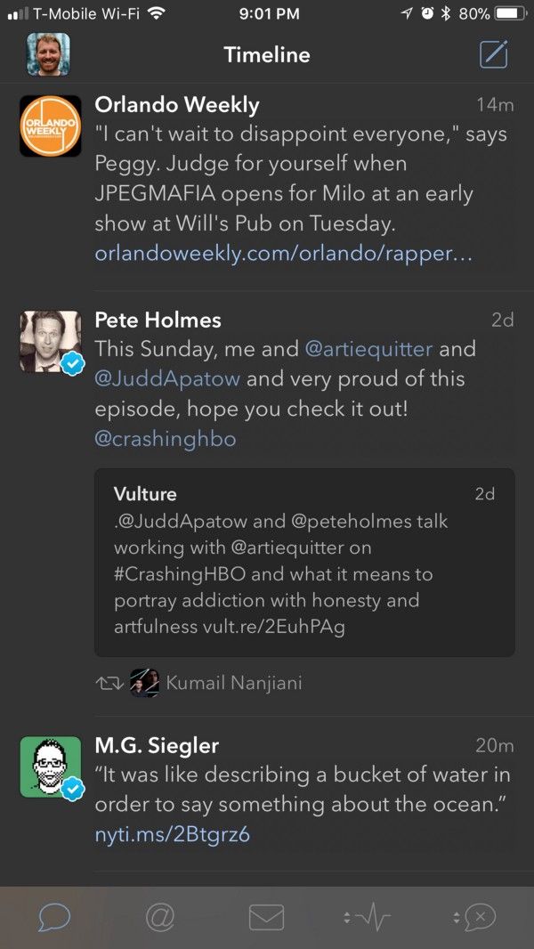
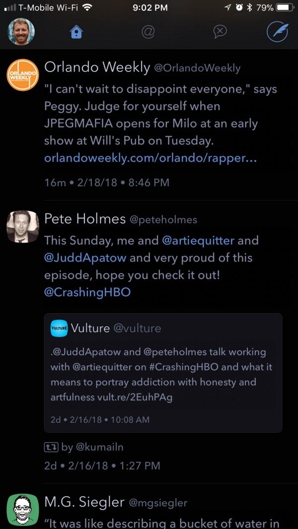
Beyond a light or dark timeline, Tweetbot allows multiple customizations. These include a choice between Apple’s San Francisco system font and Avenir (my preference), the way avatars display, embedded image size, and if verified badges show or not.
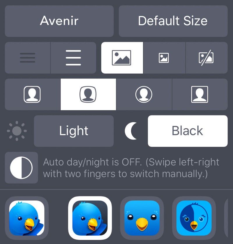
Twitterriffic allows many of the same customization features, but take a few a steps further. There are multiple font options and the line height is adjustable too. Four different avatar options are available and even the app’s icon has multiple options. The MacOS version of Twitterriffic allows themes to be edited and customized. However, verified badges don’t display on iOS and there is no preference setting to enable them. Update (2/19): Today Twitterriffic announced support for verified badges on MacOS.
Twitterriffic has an option for a “unified timeline”. This combines mentions and direct messages into the main timeline. Tweetbot lags behind here, requiring a separate tab for each feature.
Based on the multiple customization options, Twitterriffic wins this round.
Embedded Images
I’ve set both apps to display “large” photos when embedded in tweets. Tweetbot preserves the aspect ratio of photos to include a large look at the included photo. Twitterriffic opts for a standard wide-format aspect ratio and crops images to fit the mask. During my test, this proved to be a huge disadvantage for Twitterriffic.
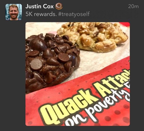

This is a tweet I posted. While both apps crop the image slightly, Twitterriffic’s image crop affects the text in the image, reducing the photo’s impact. This is a strange design choice and one that can result in bizarre presentations.
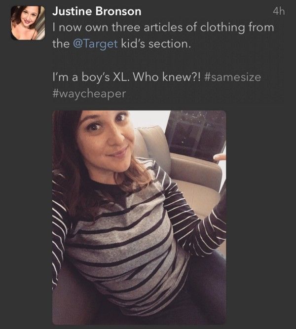
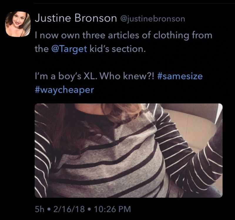
This is the same tweet from Justine Bronson presented in both apps using the largest image display size. The auto-crop that Twitterrific uses results in a rather awkward display of the embedded image.²
The winner here is clearly Tweetbot.
Quoted Tweets
While Twitterrific crops images, they don’t crop quoted tweets. The full tweet displays under the new comments. Tweetbot makes an odd choice to cut off longer quoted tweets, requiring a tap to read the remainder.
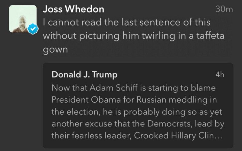
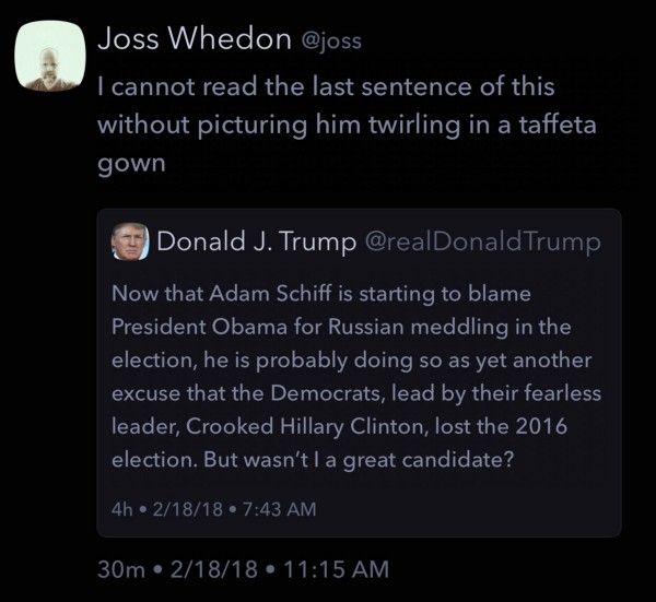
Like Twitterrific’s choice to crop photos, this is a strange design choice on Tweetbot’s part.
The winner here is Twitterriffic.
Activity Feeds
Both Tweetbot and Twitterrific offer an activity feed to keep track of people’s interaction with your tweets. They capture retweets, likes, new followers, and quoted tweets.
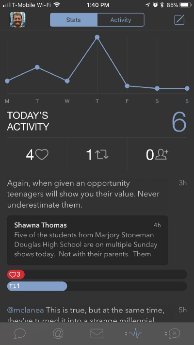
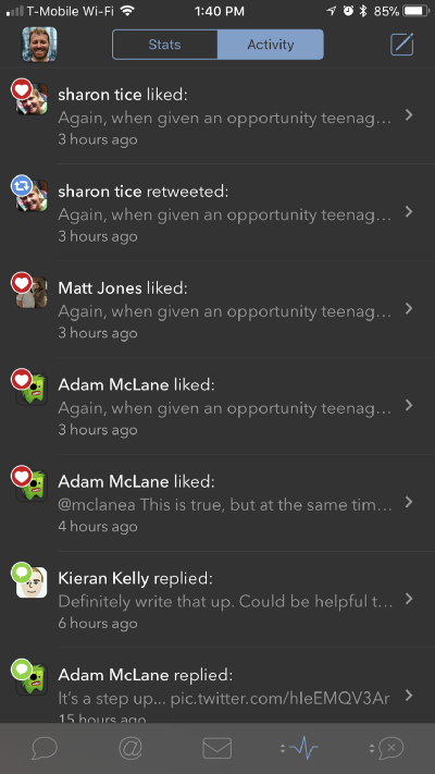
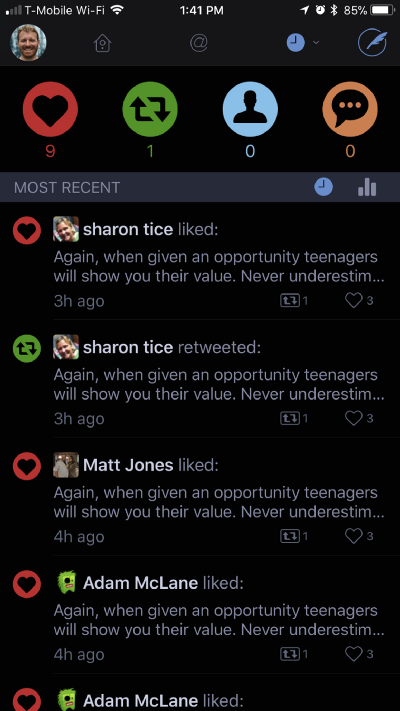
Tweetbot uses a two panel approach. In the first panel a graph tracks interactions over the last week while the second panel maintains a real-time activity feed.
Twitterrific’s Today View provides a list of interactions over the last 24-hours. In an odd choice, Twitterriffic powers Today View with push notifications. Without banner, sound, or badge notifications turned on Today View remains stagnate. I’m forced to choose between push notifications and tracking my Twitter activity. Regardless of the option, push notifications lose every time.
Tweetbot wins for not requiring push notifications.
Overall Impressions
Twitterriffic and Tweetbot each have unique flourishes that provide additional charm. Swiping up or down with two fingers in Tweetbot switches between light and dark mode — like flipping a light switch. In Twitterriffic, the same gesture switches between accounts which is a much more practical application.
Each iOS app syncs with their MacOS counterpart through iCloud. While I currently cannot test how this functions in Twitterriffic, Tweetbot’s sync feature works flawlessly.
There are a few things that both app cannot do thanks to Twitter’s API restrictions. Neither can display Twitter polls or link cards. Twitterriffic has a workaround to display tweets containing polls, but still require a visit in Safari to vote. Again, these are things I’m willing to overlook for a chronological and ad-free timeline.
While Tweetbot takes a straightforward approach to settings (they’re all in a dedicated place), Twitterriffic opts to overlay settings on the timeline. An errant miss-tap will close the settings panel, regardless if you have accomplished your goal or not. Again, this is an odd choice on Twitterriffic’s part.
Twitterriffic is an app from the Icon Factory, a company renowned for their graphical styling. While their app looks great, there are a few head scratching choices — namely with image handling. I’ve purchased every version of both Twitterriffic and Tweetbot for iOS over the years, but in the end I always end up preferring Tweetbot. This time is no different.
Tweetbot, after earning another point in Overall Impressions, wins over Twitterrific four to two.
¹: If someone wants to send me an iPhone X, I’ll be happy to test this claim.
²: Thanks to Justine Bronson for permitting use of Twitterriffic’s strange auto-crop of her photo.
Thanks to Kieran Kelly’s twitter conversation for inspiring this comparison.


