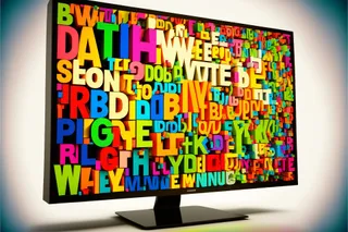
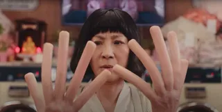
Write Like Taylor Swift
Embrace life’s many eras and stop trying to be a one-dimensional writer.
So much of writing advice is dedicated to finding a niche. Many supposed writing gurus harp on determining your "anchor content" and then basically just reworking that same idea forever.
I'm not here to say that niching doesn't work because it does. Writing about our expertise is always a good idea. But, I am here to challenge the forever part. Writing about the same thing or in the same style over and over again gets incredibly boring. This is where I start to have a problem with niching.
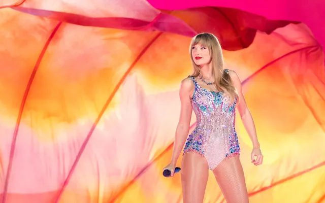
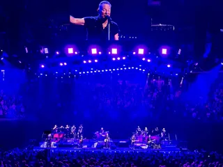
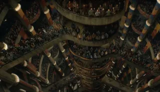
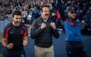
This weekend, I watched Taylor Swift's Eras Tour on Disney+. What's funny is that I refuse to watch Oppenheimer because it's 3.5 hours long, but I had zero issues watching the 3.5 hour concert. For the record, I enjoyed every minute.
The concert is an incredible testament to Swift's monumental career. Just about everything she produces is a genuine hit, and the concert is a nonstop reminder of her superstardom.
The Eras Tour is also a distinct reminder that Swift never limited herself to a single niche. From country to pop to folk, Swift embraced her distinct eras and let her songwriting cross genres.
They say variety is the spice of life, so why should we limit ourselves to one kind of writing?
The other thing of note about Taylor Swift's concert film is that I'm certain her discography doesn't represent the complete extent of her creativity. For every song that made the various albums, I'm sure plenty more were left out.
The only way we grow as writers is by breaking out of niche-imposed boxes. The benefit, outside of our own growth, is that experimenting is a lot of fun! We play and, if it works, great! If it doesn't, we hit delete and work on the next thing.
Explore your passions and embrace your current writing era, whatever it might be.
For anyone wondering, my favorite era is 1989, followed closely by Lover.
Personal Choice in Web Design
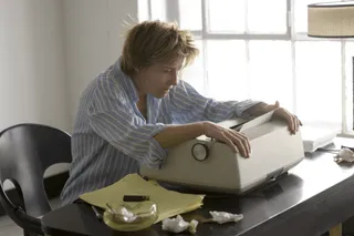
I built my first website sometime around 1998. It was hand-coded with HTML and CSS I learned by reading other site's source code. Yes, I'm that kind of nerd.
That first site, built on Geocities, had a black background, white text, and yellow accents. I guess I favored a nice dark mode before it existed as a system preference.
For the last few weeks, I've been rebuilding my website from the inside out. I've been curious about other people's preferences throughout the build process. Typically, I build websites like I write; I focus on what I want to see. This time, though, I was curious about what others thought.
I asked about your light or dark mode preference a few weeks back, and while there was no consensus, the opinions were incredibly strong. One response that stood out (but was also pretty indicative of the others) was this one:
It better be a light mode but you better let me change it, too!
Pretty direct, but I hear you loud and clear.
Last week, I asked Mastodon about the ideal web page font size. The responses came back suggesting using font-size: 100% as the site's base. This, according to the explanations, allows the user to adjust their font size in the system/browser settings.
The internet should be personal. Everyone's individual preferences should be reflected and respected. Not only does this make the web more personalized, but it also allows it to be more accessible, too.
I've enjoyed rebuilding my site (which is probably about 85% complete). Building in user choice while maintaining my own preferences and design flair has been a lot of fun.
For those wondering, my site defaults to your theme system preference, and you can change it by hitting the appropriate button in the menu.
Related Reads
What Bad Bunny Gets That NBC Doesn’t
This Just In: NBC hosted the Olympics, the Super Bowl, and Bad Bunny’s halftime show on the same night, so why was their messaging so poor?
This One’s for the Fans
This Just In: Jimmy Buffet gets the due he deserves and shows what creative passion is all about.

Let’s Talk About Streaking
This Just In: I’ve racked up a 56-day streak, but not in writing. Plus, I talk about Eurovision.

Write Like Taylor Swift
Embrace life’s many eras and stop trying to be a one-dimensional writer.

Why Is Branding So Difficult?
This Just In: This Week In Writing rebrands; still explores the world with creativity and curiosity.

Advent, Waiting, and the Year of Transitions
This Week In Writing, we look back at the year that was and determine what it means for the year to come.
AI Is Now Everywhere
This Week In Writing, we talk about Google’s new AI plan, what it means for writers, and why resistance is futile.
The Problem With Creative Entitlement
This Week In Writing, we explore how AI tools amplify the sometimes problematic relationship between creator and consumer
You Have Questions, I May Have Answers
This Week In Writing, we celebrate International Question Day by listening to Selena Gomez. What does that have in common? Keep reading!
How I Come Up With Writing Topics
This Week In Writing, we explore topic generation while celebrating the best damn band in the land!

This Just in: Horizontal Skyscraper City Coming Soon to the Desert
Every post-apocalyptic movie ever made will soon culminate in the Saudi Arabian horizontal skyscraper city.

How To Disconnect From The Internet Without Going Broke
We can’t hand our social media accounts to a pricey team as celebrities do—but there are actionable steps we can take toward a healthier relationship with media.
Feeling Pressure to Write?
This Week In Writing, we explore the life and writing lessons about pressure and perfection from the movie Encanto.

Do You Write Short-Form Content?
This Week In Writing, we bundle up for the longest night of the year by exploring writing’s shortest form.

Finding Unconventional Growth Opportunities
Living our best lives requires continual refinement, growth, and education. How are you investing in yourself?

What's On Your Desk-Work Playlist?
📝 This Week’s Goal: Find music that inspires but doesn’t distract.
Are You Writing For An Audience Or Authenticity?
What Emily Dickinson’s fictitious life teaches about fame
Learn Something New
What I have in common with Selina Gomez and Jon Favreau.

Get In The Mood: Level Up Your Writing Soundtrack
Help your mind focus while having a little fun by setting up a custom writing playlist

Breathe in. Breathe out. Move on.
Are you burnt out? You’re not alone. Take some advice from Jimmy Buffett: Breathe in, breathe out, move on.

This Just In: Support Other Artists
You can be a patron of the arts without buying a wing in your local theater

This Just In: Young, Scrappy, and Hungry
Today we celebrate our Independence Day. From our couch. With musical theater.

Learning About History From Television
Our history classes need an upgrade

How To Win NaNoWriMo: Be A Rebel
Being a NaNoRebel begins where you’d least expect

What We Can Learn About Writing from Bruce Springsteen
It took Bruce Springsteen six months to write Born to Run. There are a lot of things writers can learn from his process and success.

Understanding Who Owns Your Art
Taylor Swift’s experience sheds light on an important question: Who owns your art? The answer isn't always clear and impacts your work.

What Happens When You Lose The Muse
Writing lessons from Jony Ive’s departure from Apple.

What We Can Learn About Writing from “Hamilton”
Let me offer you some free advice…

I Still Know All The Words to “The Sign”
What I learned fixing my iTunes Library.

Is it “Mambo №5” or “Mambo No. Five”?
Working with Numbers

Why be Perpendicular When You Can be Parallel?
As the song says, you get three as a magic number. But what you also get is a perfect example of parallel structure.

Who’s the G.O.A.T.
What makes us great isn’t what you think.

How to Write When You Don’t Wanna Write (As Told By Other Writers)
This article was completely crowdsourced.

How To Be A Successful Freelance Writer
Every choice brings you closer to success. Or does it?

Girls, Robots, and Rock: Tokyo’s Amazing Robot Restaurant
Tokyo has a building with LED lights and chrome so bright it’s like staring into the sun. This is Shinjuku’s Robot Restaurant.

Why Aren’t We Singing?
Thoughts on Las Vegas, Unity, and the Philippians

90’s Lyrics Were Whack
But I loved them anyway.

A Place in the House
Exploring Good News

Generative AI in Creativity
The reader survey results have some interesting things to say about generative AI and creativity. Here’s why that’s a problem.
Write Like Taylor Swift
Embrace life’s many eras and stop trying to be a one-dimensional writer.
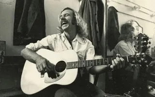
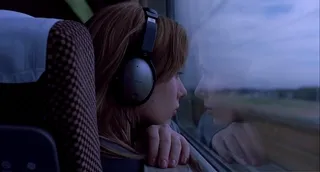
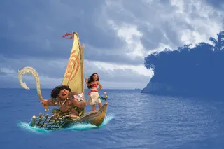
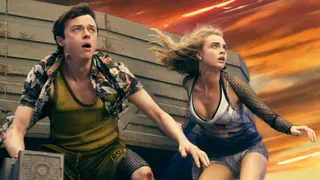
TAYLOR SWIFT | THE ERAS TOUR (2023)
⭐️⭐️⭐️⭐️⭐️

Don’t Feed the AI Beast
This Just In: Justin’s writing requires a subscription to prevent AI abuse; consider your own precautions.

Saving Frequently Isn’t The Only Way To Backup Your Writing
This Week In Writing, we take a hard lesson from the latest Twitter/X hijinks. Plus, we look at what “human writing” means.
Understanding Who Owns Your Art
Taylor Swift’s experience sheds light on an important question: Who owns your art? The answer isn't always clear and impacts your work.
I Still Know All The Words to “The Sign”
What I learned fixing my iTunes Library.
What Bad Bunny Gets That NBC Doesn’t
This Just In: NBC hosted the Olympics, the Super Bowl, and Bad Bunny’s halftime show on the same night, so why was their messaging so poor?

The Dream of EPCOT
This Just In: Walt Disney’s community of tomorrow is a celebration of humanity and a prototype for how we should live. Maybe we should listen.
It’s Time to Rebel from Mass Market Social Media
This Just In: IT is the villain in Silo. We should learn from those in the Down Deep and rise up.

The Forthcoming First Amendment Fight
This Just In: So-called defenders of free speech are taking office, and we’re all in trouble. Plus, more predictions for 2025.

Is Reading Dying
This Just In: AI summaries and the pivot to video are bad news for the written word.

Empire Strikes Back Isn’t the End of the Series
This Just In: Last week sucked, but there is always hope.
This One’s for the Fans
This Just In: Jimmy Buffet gets the due he deserves and shows what creative passion is all about.

When Creating Stops Being Fun
This Just In: knowing when (and how) to hit delete is important for every creator’s sanity.
Fandom Is Being Ruined by "Fans"
How review-bombing and constant, unfounded criticism takes agency away from creators

Share, But Don’t Spoil
A more personal internet relies on user recommendations but doesn’t spoil their experience.

Why Criticize When You Can Celebrate?
The attention economy destroyed our ability to dream for the sake of page views. It’s time we refocus our attention.
Write Like Taylor Swift
Embrace life’s many eras and stop trying to be a one-dimensional writer.

Metrics Don’t Matter
Have we become so accustomed to seeing metrics everywhere that they no longer mean anything?

Creation and Destruction Are Connected
This Just In: The act of creating something is more important than the act of publishing what is made.

Don’t Take My Word for It
This Just In: Personalized recommendations are the new algorithms and the best way to build a true audience.
What The Creator and Rebel Moon Have In Common (and What They Don't)
Star Wars may inspire the latest sci-fi epics, but they both have (at least) one fatal flaw.
Expanding Universes Make Better Stories
This Week In Writing, we look at how worldbuilding is an essential part of epic storytelling.
The Problem With Creative Entitlement
This Week In Writing, we explore how AI tools amplify the sometimes problematic relationship between creator and consumer
How Do You End Things Well
Succession and Ted Lasso ended last week. Both had a distinct impact on culture and were met with intense anticipation despite relatively small audiences. Don't worry, there aren't any real spoilers in this article. I enjoyed both endings for different reasons. Succession brought a sense of
How I Come Up With Writing Topics
This Week In Writing, we explore topic generation while celebrating the best damn band in the land!
What’s the Last Book You Read
https://writingcooperative.com/whats-the-last-book-you-read-5265b44e180e
Success Comes to Those Who Work for It (Usually)
This Week In Writing, we talk about success and perseverance through the lens of Simu Liu’s memoir. Oh, and AI writing, too.
The Fate of The Seven Kingdoms
The future on social media is much like the Game of Thrones. Right now, the only thing missing is a dragon.
You’re Invited
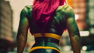
This Week In Writing, we prepare for NaNoWriMo with a special invitation, but first, we talk about She-Hulk!
What Word Makes You Cringe?
This Week In Writing, we talk about cringe-worthy words and give a nod to puns, courtesy of Letterkenny.
This Just in: Horizontal Skyscraper City Coming Soon to the Desert
Every post-apocalyptic movie ever made will soon culminate in the Saudi Arabian horizontal skyscraper city.

This Is a Bit Revealing
This Week In Writing, I reveal my inner nerd by sharing a personal project. Plus, we look at character creation.
Do You Color Outside the Lines?
This Week In Writing, we explore taking our writing to places the reader doesn’t expect, like in the film Everything Everywhere All At Once.

Write Now is My Tribe of Mentors
What I learned from Tim Ferriss’ Tribe of Mentors and my answers to his 11 great questions.

Can You Write Pulp Fiction?
This Week In Writing, we celebrate classic pulp fiction and invite you to explore potentially untapped forms of creativity.

Does Your Writing Live Long and Prosper?
This Week In Writing, we celebrate First Contact Day by exploring one of the best genres out there: sci-fi!

Celebrate International Women’s Day With These Writers
This Week In Writing, we celebrate International Women’s Day but uplifting and honoring our favorite women authors.
Are You Not Entertained?
We’ll enjoy our entertainment more if we stop putting so much pressure on the things we enjoy and the creators who make them.

Why Do You Write?
This Week In Writing, we reflect on Dickinson and explore an essential question for every writer: why do you write?
Feeling Pressure to Write?
This Week In Writing, we explore the life and writing lessons about pressure and perfection from the movie Encanto.

Exploring Other Genres and Markets
Saga’s return uncovers a vast catalog of successful freelance writers creating characters and worlds that many are unaware of.
Writing in Multiple Languages? Don’t Get Lost in Translation.
This Week In Writing, we explore how translating language can often change the meaning and intent of our writing.
Handwriting As An Art Form
Japanese calligraphy, or shodo, turns handwriting into a unique work of art. No matter what our handwriting looks like, it’s also art.

Improve Your Writing by Celebrating the Dead
This Week In Writing, we celebrate Day of the Dead by learning from writers and ideas no longer with us. How do past writers inspire you?

How Do You Make Villains Likable?
This Week in Writing we look forward to Succession season three and celebrate the unlovable, but captivating, villain.
Do You Cross Genres?
This Week In Writing we look at the genre-crossing anime Cowboy Bebop to learn how to tell more interesting and unique stories
Messing With Perfection
Netflix released production stills for the upcoming Cowboy Bebop live-action remake. Is it possible to mess with perfection and succeed?
Ted Lasso Takes Personal Marketing To Another Level
A personal email from Ted Lasso showcases the power of direct and personalized email marketing. Spoiler alert: shorter is better.

Do You Misattribute Quotes?
📝 This Week’s Goal: Don’t be Ted Lasso. Well, be Ted Lasso most of the time.
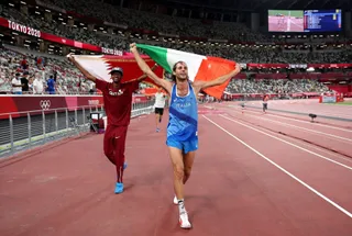
It’s Time To Stop Competing and Start Celebrating
What writers can learn from the Tokyo 2020 men’s high jump final about competition and celebrating with our friends

Even With Peacock, NBC Doesn’t Understand Streaming
I thought Peacock would be a hub of streaming Olympic content. Unfortunately, Peacock proved NBC doesn’t understand streaming.

Can Tokyo 2020 Bring The World Together Safely?
In addition to the athletes, many people dedicated their lives to creating Tokyo 2020. Their work deserves an audience. But at what cost?
What Gets You Geeked About Writing?
📝 This Week’s Goal: Embrace your inner geekiness and enjoy your writing.
Black Widow Premier Access Proves Movie Theaters Are Obsolete
I paid $29.99 to not deal with other people. It was wonderful.
What's On Your Desk-Work Playlist?
📝 This Week’s Goal: Find music that inspires but doesn’t distract.

Where Do You Find Inspiration?
📝 This Week’s Goal: Don’t dismiss the power of the muse.

Where Do You Get Feedback?
📝 This Week’s Goal: Build a team of trusted peers to help you grow as a writer

Failure To Try Is Holding You Back
Take a cue from Nike and just do it

Stop Creating a Minimum Viable Product
As creators, we should strive to share our best with the world

Eat Your Words: Eternal Return
Are you familiar with the philosophical concept?

Claim A Scrabble Triple Word Score
📝 This Week’s Goal: Expand your vocabulary with the classic board game

Have You Ever Written A Video Game?
📝 This Week’s Goal: Don’t be afraid to try writing for other genres.

We Go Together…
Combining two passions into one amazing opportunity

What’s Your Favorite Story?
A reflection of storytelling through the lense of a pandemic pastime
Are You Writing For An Audience Or Authenticity?
What Emily Dickinson’s fictitious life teaches about fame

Get Twisted
📝 This Week’s Goal: Learn how to keep your readers guessing until the very end.

Don’t Be A Dick: Give Advice Without Being Negative
How to apply Wheaton’s Law to your writing and provide helpful, positive advice

Plant a seed (or two).
Everything is a copy of a copy of a copy of a copy…
Want to Be Successful? Move Beyond the Reef.
What entrepreneurs can learn from Moana’s adventure to restore the heart of Te Fiti
Get In The Mood: Level Up Your Writing Soundtrack
Help your mind focus while having a little fun by setting up a custom writing playlist
Did You Catch My Cameo in The Way I See It?
This Just In: I’m Famous
This Just In: Choice In Video Games
The higher education bubble is finally bursting
This Just In: Never-Ending Stories
In a world of uncertainty, it’s time we don’t take our storytelling too seriously. There's a lot to learn from fanfiction and the MCU.
This Just In: Support Other Artists
You can be a patron of the arts without buying a wing in your local theater
This Just In: Young, Scrappy, and Hungry
Today we celebrate our Independence Day. From our couch. With musical theater.
Learning About History From Television
Our history classes need an upgrade

Choosing Growth Over Fear In A Time Of Uncertainty
NASA's process of landing on the moon can teach us to start choosing growth when things are hard. Tackle little things one at a time.

Is There Anything New Under The Sun?
What do the NHL, Disney, and you have in common?

Unlock Your Creativity In Three Hours Or Less
Kick off 2020 with the only advice you need
Being Good with Okay: Breaking the Block
Self doubt doesn’t have to be debilitating. So why do we let it conquer us?
What We Can Learn About Writing from Bruce Springsteen
It took Bruce Springsteen six months to write Born to Run. There are a lot of things writers can learn from his process and success.
Understanding Who Owns Your Art
Taylor Swift’s experience sheds light on an important question: Who owns your art? The answer isn't always clear and impacts your work.

Maybe I’m Not A ‘Writer’ (And Maybe You Aren’t Either)
What I’ve learned from Andy Weir and Glynnis MacNicol about calling myself a writer.
What We Can Learn About Writing from “Hamilton”
Let me offer you some free advice…

What Are You Waiting For?
How analysis paralysis and fear of failure limit our ability to succeed.

Winter is Coming, But So is the Dawn
Bringing light into a time of darkness.

I Am Not James Patterson
And Neither Are You

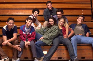
What I Learned About Writing From My Film School Friends
It’s about more than storyboards.
Is it “Mambo №5” or “Mambo No. Five”?
Working with Numbers
Why be Perpendicular When You Can be Parallel?
As the song says, you get three as a magic number. But what you also get is a perfect example of parallel structure.
Political Signs, Queer Eye, and Jesus
Are we speaking the same language?

Repeating Yourself is Redundant
A Pleonasm For Your Thoughts?
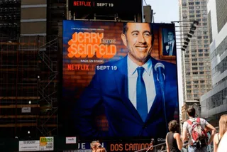
7 Things We Can Learn From Jerry Seinfeld About Writing
Writers of all shapes and genres can learn a lot about writing from Jerry Seinfeld and the comedians he interviews.

Olympic Chinquapins
Celebrating the World Games through verse.

What We Can Learn About Writing From Back to the Future
Sometimes the KISS-method isn’t enough.

What We Can Learn About Writing From Tinker Hatfield
VP of Design and Special Projects at Nike
Girls, Robots, and Rock: Tokyo’s Amazing Robot Restaurant
Tokyo has a building with LED lights and chrome so bright it’s like staring into the sun. This is Shinjuku’s Robot Restaurant.
90’s Lyrics Were Whack
But I loved them anyway.
Does Valerian and the City of a Thousand Planets hold up to The Fifth Element?
This film did not make any money.
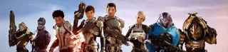
Thoughts While Playing Mass Effect for Seven Straight Hours
Or: How I Spent My Day Off
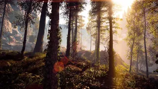
How I Spent 45 Hours as a Huntress in a Post-Apocalyptic Wasteland
Horizon: Zero Dawn is Amazing
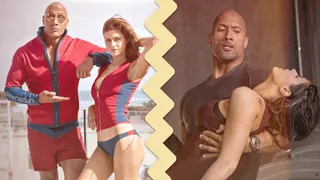
The Ultimate Dwayne Johnson and Alexandra Daddario Memorial Day Movie Showdown
Comparing the disaster porn San Andreas to the beach porn Baywatch determines the ultimate Dwayne Johnson / Alexandra Daddario movie.

Overcoming Social Anxiety at a Video Game Convention
Discover what it was like attending PAX in 2008, including meeting Felicia Day and experiencing social anxiety at the convention center, in this entertaining article.
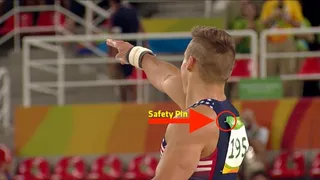
Things I Don’t Understand about Olympic Gymnastics
The Olympics are here!
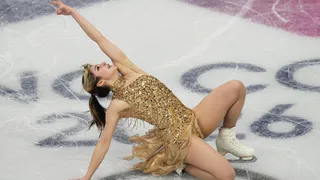
Creative Burnout and Why I’m Pausing The Writing Cooperative After 12 Years
Alysa Liu's story is relatable and the timing is impeccable.
What Bad Bunny Gets That NBC Doesn’t
This Just In: NBC hosted the Olympics, the Super Bowl, and Bad Bunny’s halftime show on the same night, so why was their messaging so poor?

AI Is Not an All or Nothing Choice
This Just In: AI use isn't a moral binary. There's a practical middle path for writers.

It’s the End of the Year as We Know It (and I Feel Tired)
This Just In: It’s time to look back at the year that was and set up some hopes and dreams for the year to come, or something like that.

Unchecked Writing
This Just In: I stopped using Grammarly; have you noticed? Plus, a deeper exploration into AI writing and my friend the em dash.
The Dream of EPCOT
This Just In: Walt Disney’s community of tomorrow is a celebration of humanity and a prototype for how we should live. Maybe we should listen.

It’s Not All About the Benjamins
This Just In: Yet one more thing that Diddy was wrong about.

The Internet Was Doomed From the Start
This Just In: Maybe it’s time to rethink the entire internet.

Want to Write a Novel in November?
This Just In: NaNoWriMo may be dead, but writers have two new options to help hit those writing goals.

Answers to a Few Questions
This Just In: There were fewer questions than I anticipated, but I will answer them nonetheless.

What Questions Do You Have
This Just In: I won’t be participating in Medium Day this year, but I still want to keep the spirit alive. Ask me anything.
What I Did Different With This Book
This Just In: Launching a second edition wasn’t as simple as I thought it’d be, and I learned some lessons along the way.
Introducing Write Now’s Revised Second Edition!
This Just In: You can now access everything I’ve learned writing online over the last two-plus decades. Are you ready for it?

Can We Talk About Comments?
This Just In: Hearing from readers is a lot of fun until you start to get spammed with bots and AI nonsense farming for attention.

Is AI Really All That Bad?
This Just In: Here comes a potentially controversial opinion.

Is Substack Really That Bad?
This Just In: Stop launching your new blog on Substack.

Let’s Talk About Tools
This Just In: There’s no single tool that can do everything and it’s extremely frustrating.

Battle of the Book Builders
This Just In: I tried to format my book using Vellum and Atticus. Instead, I learned something about app design and limitations.

Does My Journal Need a Backup
This Just In: I took a lot of your suggestions to heart and gave Obsidian a try. What I found was a bigger question.

Journals Aren’t Forever
This Just In: After over 13 years, I’ve deleted the Day One journal app. Here’s what it helped me realize about software subscriptions.

This One Has No Direction
This Just In: Tried, drained, and a little burnt out isn’t exactly the best time to focus on your writing, but it’s why you do it anyway.

AI Exposes the Deeper Rifts in the Writing Industry
This Just In: Monetization turns passions into sweatshops and AI is making it worse.

The Cost of Rebellion
This Just In: Rebellions are built on hope, but they require individual sacrifices for collective improvement.

Abuse of Power Comes for Nonprofits
This Just In: Wikipedia’s 501(c)(3) tax exemption is threatened, but not by the IRS.

How to Move to Ghost In 2025
This Just In: Own your own publication by launching a website running Ghost. It’s not as difficult as it sounds.

AI Killed NaNoWriMo
This Just In: The writing month challenge may be dead, but there’s a new option to keep writers going.

The Age of Reaction
This Just In: We’ve fallen into a dramascroll trap that will be very difficult to climb out of, but it isn’t impossible.

A Few More Thoughts on Copyright
This Just In: The history of copyright might be fraught, but it exposes a bigger issue when creating online.

Copyright in the Age of AI
This Just In: What does copyright do and does it even matter anymore?

Tapestry Is Weaving the Future Web
This Just In: The Iconfactory’s smash new app is a return to the web’s roots and where we all need to head.

The Cost of Simplification
This Just In: Owning your own platform can be complicated and sometimes simplifying can be costly.
A Bit About Me
This Just In: I answer interview questions that cover my views on writing and more.

The Perils of Personal Platforms
What does it actually mean to leave the world of commercial platforms behind?
Update Those Mute Filters
This Just In: Let’s collectively scream into the infinite abyss, find ourselves, and make the world better.
It’s Time to Rebel from Mass Market Social Media
This Just In: IT is the villain in Silo. We should learn from those in the Down Deep and rise up.
The Forthcoming First Amendment Fight
This Just In: So-called defenders of free speech are taking office, and we’re all in trouble. Plus, more predictions for 2025.

What Happens When Everything is Paywalled
This Just In: Wealth is becoming a determining factor in the type of World Wide Web you can access. And I’m not talking about speed.

Platforms Are Getting Much Worse
This Just In: Platforms want us to know exactly who controls the internet. It’s not us, but it can be!
Is Reading Dying
This Just In: AI summaries and the pivot to video are bad news for the written word.
Empire Strikes Back Isn’t the End of the Series
This Just In: Last week sucked, but there is always hope.
Are Apple’s Writing Tools the Right Stuff
This Just In: Apple Intelligence offers the boring version of AI I’ve hoped for, but is it helpful for writers?
This One’s for the Fans
This Just In: Jimmy Buffet gets the due he deserves and shows what creative passion is all about.
When Creating Stops Being Fun
This Just In: knowing when (and how) to hit delete is important for every creator’s sanity.
We Shouldn’t Have Taken Milton’s Stapler...
This Just In: Hurricane Milton is becoming a real problem, and I’m exhausted.
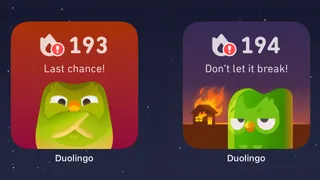
When Gamification Goes Awry
Writing days, health rings, Duolingo… there are more streaks than time.

New Phone Who Dis
New technology fuels a desire to create but can also be overwhelming and lead to unmet expectations.

Hitting the Reset Button
LLM scraping is a virus eating up the internet, but I’m done fighting. Instead, I choose open access and human connection.

Advice for Medium Writers Choose Publications Wisely
Just because you CAN submit to a specific publication doesn’t mean you SHOULD.
Medium Day 2024: Questions I Didn't Have Time to Answer
A collection of all the questions I didn’t have time for during my 30-minute Medium Day presentation.

Is Generative AI Destroying the Open Web
Subscription walls prevent AI scraping, but at what cost? I’m rethinking my whole publishing strategy.

Our Words Are Our Legacy
Creativity is a clash between individualism and our connection to history.
Fandom Is Being Ruined by "Fans"
How review-bombing and constant, unfounded criticism takes agency away from creators

The Downside of Personal Platforms
Creators need to think carefully about their personal sites and build in a way that prevents link rot.

When Art Inspires Life
The magic of writing, travel, and movies about Japan.
Is Apple Intelligence the AI for the Rest of Us
This Just In: Apple’s forthcoming entry into AI promises a private, personalized AI, but will it increase AI slop?

Maybe I’m Bad at Social Media
Social media “growth” requires giving in to quantity over quality. I don’t play that game.
Share, But Don’t Spoil
A more personal internet relies on user recommendations but doesn’t spoil their experience.
Let’s Talk About Streaking
This Just In: I’ve racked up a 56-day streak, but not in writing. Plus, I talk about Eurovision.

Chase Your Dreams and See What Happens
This Just In: Mental health is a massive part of confidence and success. Dreams are inspiration. Use them.
Generative AI in Creativity
The reader survey results have some interesting things to say about generative AI and creativity. Here’s why that’s a problem.

What Is Your Freelance Writing Rate
Writing jobs are evaporating for many reasons, but freelance rates were really bad long before AI came around.
Why Criticize When You Can Celebrate?
The attention economy destroyed our ability to dream for the sake of page views. It’s time we refocus our attention.

Can We Find a Balance With AI?
The dichotomy of AI continues to baffle me as I see the good and the bad. Where do we draw the line, and how do we learn to live with this technology?
Where Have All the Cowboys Gone
This Just In: social media is bleeding users, but where are they going?
Write Like Taylor Swift
Embrace life’s many eras and stop trying to be a one-dimensional writer.
Metrics Don’t Matter
Have we become so accustomed to seeing metrics everywhere that they no longer mean anything?
Celebrating a Decade on Medium
Looking back at the past ten years of writing on Medium and what comes next.
Creation and Destruction Are Connected
This Just In: The act of creating something is more important than the act of publishing what is made.
Don’t Take My Word for It
This Just In: Personalized recommendations are the new algorithms and the best way to build a true audience.
Don’t Feed the AI Beast
This Just In: Justin’s writing requires a subscription to prevent AI abuse; consider your own precautions.

Sending Emails Is Hard
This Just In: Google and Yahoo crack down on bad behavior; set your DKIM, DMARC, and SPF records now.
Why Is Branding So Difficult?
This Just In: This Week In Writing rebrands; still explores the world with creativity and curiosity.
Why Make Anything if You Don’t Think It Will Be Great?
This Week In Writing, we discuss greatness and how chasing it is a possible and noble goal.

Pay People Not Platforms
This Week In Writing, we look at why Substack’s collapse is actually a good thing for paid newsletters.

Let's Make the Internet Personal Again
This Week In Writing, we look at the once-in-a-generation opportunity to create a new internet filled with fun and originality.

Raising the Bar at the Writing Cooperative
This Week In Writing, we look at changes to our publication standards and what they mean for you.
Advent, Waiting, and the Year of Transitions
This Week In Writing, we look back at the year that was and determine what it means for the year to come.

Refilling the Creativity Tank
This Week In Writing, we discuss what happens when creativity finds other outlets.

Celebrate Giving Tuesday
This Week In Writing, we take a quick break from our regularly scheduled programming to celebrate nonprofit organizations.

It’s Time We Discuss Medium
This Week In Writing, we address the platform that has supported my writing for nearly a decade.

My First Year on Mastodon and the Future of Social Media
This Week In Writing, we look back at how social media fractured and why it’s a good thing for us all.

The Economics of a Self-Hosted Newsletter
This Week In Writing, we talk about what happens when you eliminate platforms and go after it on your own.

Trick or Treat?
This Week In Writing, we talk about pen names and whether they make sense for writers.

A New Era Begins
This Week In Writing, we explore the internet’s current metamorphosis and how you can be part of the revolution.
My History of Blogging
This Week In Writing, we celebrate the blog, explore the pendulum of online writing, and double down on quality.

An Update on Spam Submissions
This Week In Writing, we talk about spam submissions to The Writing Cooperative and look at some of your thoughts on being called AI.

Would You Want to Know if I Thought Your Writing Sounded Like AI
This Week In Writing, we talk about submissions to The Writing Cooperative and how to avoid false accusations.

How I Feel About Engagement Numbers
This Week In Writing, we discuss what engagement means and if I get discouraged by a perceived lack thereof. Plus, a look at the future (again).

My Writing Is About Building Community
This Week In Writing, we highlight some of the people I’ve met writing online and answer some of your questions.
It’s Time for a Fresh Start
This Week In Writing, we talk about new Apple products, home renovations, and changes to the newsletter.
Choose Your Own Design
This Week In Writing, we explore the wonderful world of blogs, where writers truly get creative.
Expanding Universes Make Better Stories
This Week In Writing, we look at how worldbuilding is an essential part of epic storytelling.
Your Questions Answered
This Week In Writing, we recap a successful Medium Day and address some of the questions I didn’t have time to answer.
Saving Frequently Isn’t The Only Way To Backup Your Writing
This Week In Writing, we take a hard lesson from the latest Twitter/X hijinks. Plus, we look at what “human writing” means.
MIT Says ChatGPT Improves Bad Writing, But At What Cost?
This Week In Writing, we explore how ChatGPT and Grammarly are making us all sound the same.

Do CTAs Even Work Anymore?
This Week In Writing, we explore the “necessary evil” of calls to action and ask if they are any better than tacky banner ads.
AI Is Now Everywhere
This Week In Writing, we talk about Google’s new AI plan, what it means for writers, and why resistance is futile.

My Ghostly Strategy: Avoid the Graveyard
This Week In Writing, we fully explore how I’m building Ghost into a self-hosted content hub and how you can too.

Another Platform Collapses
This Week In Writing, we talk about Reddit and what it means for centralized communities moving forward.
The Problem With Creative Entitlement
This Week In Writing, we explore how AI tools amplify the sometimes problematic relationship between creator and consumer
Creative Burnout and Why I’m Pausing The Writing Cooperative After 12 Years
Alysa Liu's story is relatable and the timing is impeccable.
What Bad Bunny Gets That NBC Doesn’t
This Just In: NBC hosted the Olympics, the Super Bowl, and Bad Bunny’s halftime show on the same night, so why was their messaging so poor?
AI Is Not an All or Nothing Choice
This Just In: AI use isn't a moral binary. There's a practical middle path for writers.
It’s the End of the Year as We Know It (and I Feel Tired)
This Just In: It’s time to look back at the year that was and set up some hopes and dreams for the year to come, or something like that.
Unchecked Writing
This Just In: I stopped using Grammarly; have you noticed? Plus, a deeper exploration into AI writing and my friend the em dash.
It’s Not All About the Benjamins
This Just In: Yet one more thing that Diddy was wrong about.
Want to Write a Novel in November?
This Just In: NaNoWriMo may be dead, but writers have two new options to help hit those writing goals.
Answers to a Few Questions
This Just In: There were fewer questions than I anticipated, but I will answer them nonetheless.
What Questions Do You Have
This Just In: I won’t be participating in Medium Day this year, but I still want to keep the spirit alive. Ask me anything.
What I Did Different With This Book
This Just In: Launching a second edition wasn’t as simple as I thought it’d be, and I learned some lessons along the way.
Introducing Write Now’s Revised Second Edition!
This Just In: You can now access everything I’ve learned writing online over the last two-plus decades. Are you ready for it?
Let’s Talk About Tools
This Just In: There’s no single tool that can do everything and it’s extremely frustrating.
Battle of the Book Builders
This Just In: I tried to format my book using Vellum and Atticus. Instead, I learned something about app design and limitations.
Does My Journal Need a Backup
This Just In: I took a lot of your suggestions to heart and gave Obsidian a try. What I found was a bigger question.
Journals Aren’t Forever
This Just In: After over 13 years, I’ve deleted the Day One journal app. Here’s what it helped me realize about software subscriptions.
AI Exposes the Deeper Rifts in the Writing Industry
This Just In: Monetization turns passions into sweatshops and AI is making it worse.
AI Killed NaNoWriMo
This Just In: The writing month challenge may be dead, but there’s a new option to keep writers going.
A Few More Thoughts on Copyright
This Just In: The history of copyright might be fraught, but it exposes a bigger issue when creating online.
Copyright in the Age of AI
This Just In: What does copyright do and does it even matter anymore?
The Forthcoming First Amendment Fight
This Just In: So-called defenders of free speech are taking office, and we’re all in trouble. Plus, more predictions for 2025.
Is Reading Dying
This Just In: AI summaries and the pivot to video are bad news for the written word.
Are Apple’s Writing Tools the Right Stuff
This Just In: Apple Intelligence offers the boring version of AI I’ve hoped for, but is it helpful for writers?
This One’s for the Fans
This Just In: Jimmy Buffet gets the due he deserves and shows what creative passion is all about.
When Creating Stops Being Fun
This Just In: knowing when (and how) to hit delete is important for every creator’s sanity.
When Gamification Goes Awry
Writing days, health rings, Duolingo… there are more streaks than time.
Medium Day 2024: Questions I Didn't Have Time to Answer
A collection of all the questions I didn’t have time for during my 30-minute Medium Day presentation.
Our Words Are Our Legacy
Creativity is a clash between individualism and our connection to history.
Fandom Is Being Ruined by "Fans"
How review-bombing and constant, unfounded criticism takes agency away from creators
When Art Inspires Life
The magic of writing, travel, and movies about Japan.
Maybe I’m Bad at Social Media
Social media “growth” requires giving in to quantity over quality. I don’t play that game.
Chase Your Dreams and See What Happens
This Just In: Mental health is a massive part of confidence and success. Dreams are inspiration. Use them.
Generative AI in Creativity
The reader survey results have some interesting things to say about generative AI and creativity. Here’s why that’s a problem.
Why Criticize When You Can Celebrate?
The attention economy destroyed our ability to dream for the sake of page views. It’s time we refocus our attention.
Write Like Taylor Swift
Embrace life’s many eras and stop trying to be a one-dimensional writer.
Metrics Don’t Matter
Have we become so accustomed to seeing metrics everywhere that they no longer mean anything?
Celebrating a Decade on Medium
Looking back at the past ten years of writing on Medium and what comes next.
Creation and Destruction Are Connected
This Just In: The act of creating something is more important than the act of publishing what is made.
Don’t Take My Word for It
This Just In: Personalized recommendations are the new algorithms and the best way to build a true audience.
Why Is Branding So Difficult?
This Just In: This Week In Writing rebrands; still explores the world with creativity and curiosity.
Why Make Anything if You Don’t Think It Will Be Great?
This Week In Writing, we discuss greatness and how chasing it is a possible and noble goal.
Let's Make the Internet Personal Again
This Week In Writing, we look at the once-in-a-generation opportunity to create a new internet filled with fun and originality.
Advent, Waiting, and the Year of Transitions
This Week In Writing, we look back at the year that was and determine what it means for the year to come.
Refilling the Creativity Tank
This Week In Writing, we discuss what happens when creativity finds other outlets.
Trick or Treat?
This Week In Writing, we talk about pen names and whether they make sense for writers.
A New Era Begins
This Week In Writing, we explore the internet’s current metamorphosis and how you can be part of the revolution.
My History of Blogging
This Week In Writing, we celebrate the blog, explore the pendulum of online writing, and double down on quality.
How I Feel About Engagement Numbers
This Week In Writing, we discuss what engagement means and if I get discouraged by a perceived lack thereof. Plus, a look at the future (again).
My Writing Is About Building Community
This Week In Writing, we highlight some of the people I’ve met writing online and answer some of your questions.
It’s Time for a Fresh Start
This Week In Writing, we talk about new Apple products, home renovations, and changes to the newsletter.
Choose Your Own Design
This Week In Writing, we explore the wonderful world of blogs, where writers truly get creative.
Expanding Universes Make Better Stories
This Week In Writing, we look at how worldbuilding is an essential part of epic storytelling.
Your Questions Answered
This Week In Writing, we recap a successful Medium Day and address some of the questions I didn’t have time to answer.
Saving Frequently Isn’t The Only Way To Backup Your Writing
This Week In Writing, we take a hard lesson from the latest Twitter/X hijinks. Plus, we look at what “human writing” means.
MIT Says ChatGPT Improves Bad Writing, But At What Cost?
This Week In Writing, we explore how ChatGPT and Grammarly are making us all sound the same.
Do CTAs Even Work Anymore?
This Week In Writing, we explore the “necessary evil” of calls to action and ask if they are any better than tacky banner ads.
My Ghostly Strategy: Avoid the Graveyard
This Week In Writing, we fully explore how I’m building Ghost into a self-hosted content hub and how you can too.

This Just in Comes Home
Welcome to the first issue of This Just In completely managed from my website!
How Do You End Things Well
Succession and Ted Lasso ended last week. Both had a distinct impact on culture and were met with intense anticipation despite relatively small audiences. Don't worry, there aren't any real spoilers in this article. I enjoyed both endings for different reasons. Succession brought a sense of

My Return to Journaling Failed Miserably
This Week In Writing, we talk about good intentions, rumored Apple products, and buying domain names
Let's Talk About Numbers
This Week In Writing, we talk about the importance of metrics and why I barely pay attention to mine.

ChatGPT, the Writer’s Strike, and the Future of Content Writing
This Week In Writing, we explore a middle-of-the-road approach to ChatGPT and the future of writing

BlueSky, Mastodon, and Notes; Oh, My!
This Week In Writing, we talk about all the “Twitter Alternatives” and what makes the most sense for writers.

On Tennis and Writing Breaks
This Week In Writing, I discuss my prolonged break from daily writing and follow up on last week’s Substack article.
Stop Creating Quantity and Start Creating Quality
This Week In Writing, we discuss Medium’s new Boost program and why the vast majority of submissions lately have been atrocious.
How I Use Midjourney to Create Featured Images for Articles
Generating unique and interesting featured images, you only need a Discord account and a little patience. Here’s how I use the tool.
You Have Questions, I May Have Answers
This Week In Writing, we celebrate International Question Day by listening to Selena Gomez. What does that have in common? Keep reading!

AI Is Coming for Content Creators
This Week In Writing, we look at how AI is changing the content landscape and why that might be a good thing.

The Era of Centralized Platforms Is Over
This Week In Writing, we discuss whether you should still own a website if you publish on Medium or Substack.

How Will History Remember Your Writing?
This Week In Writing, we talk about the magic found in old books
How I Come Up With Writing Topics
This Week In Writing, we explore topic generation while celebrating the best damn band in the land!
Introducing My Writing Community!
A new way to connect with writers, discuss your interests, and receive feedback on your creative endeavors.
Are You Begging for Eyes in the Attention Economy
This Week In Writing, we explore the internet’s move away from the attention economy and how writers can make the web more personal
Use Better Words to Be More Inclusive
This Week In Writing, we talk about words to avoid in 2023, a special offer from a friend, and Medium joining Mastodon
What Biases Do You Bring to Your Projects
This Week In Writing, we explore biases in our creative pursuits and how those biases can translate to AI-generated content.
Welcome to 2023. Now Take A Nap.
This Week In Writing, we kick off a new year with a chat about goals, self-care, and naps.

I Created a New Language in 5th Grade
This Week In Writing, we explore our digital legacies, discuss permanence, and close out the year with something new.
What’s the Last Book You Read
https://writingcooperative.com/whats-the-last-book-you-read-5265b44e180e
Success Comes to Those Who Work for It (Usually)
This Week In Writing, we talk about success and perseverance through the lens of Simu Liu’s memoir. Oh, and AI writing, too.

Would You Burn Your Entire Archive
This Week In Writing, we contemplate throwing out our leftovers and slimming down our digital presence.
Give Thanks to Our AI Overlords
This Week In Writing, we celebrate Thanksgiving and dive into the ever-improving AI-generated content.

Do You Procrastawrite
This Week In Writing, we talk about procrastination and everything we do instead of writing.

Let’s Talk About Money
This Week In Writing, we talk about earning money as a writer online and check in on NaNoWriMo.
Happy Author’s Day
This Week In Writing, we kick off NaNoWriMo by celebrating all the author’s out there, whether published or not.
You’re Invited
This Week In Writing, we prepare for NaNoWriMo with a special invitation, but first, we talk about She-Hulk!
Get Ready for NaNoWriMo
This Week In Writing, we prepare for National Novel Writing Month (NaNoWriMo) with encouragement and a special offer.
How Do You Deliver Joy
This Week In Writing, we discuss how to find your joy and how to spread joy to others.
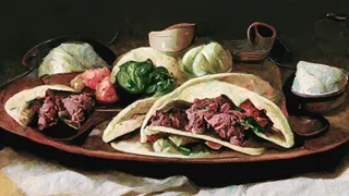
Let’s Taco ‘Bout Giving the Reader More
This Week In Writing, we celebrate National Taco Day by discussing ways to hook the reader and give them more to chew on.

Stop Making Excuses and Write
This Week In Writing, we explore excuses we use to avoid writing and discuss methods to get out of our own way.

Did You Hug Your Boss Today?
This Week In Writing, we explore inappropriate workplace dynamics and how that applies to writers.

How Do You Fight Procrastination?
This Week In Writing, we explore the bane of most writers’ existence: procrastination. And, yes, it’s different from Writer’s Block.

This Just In: Thank You, Subscribers
I don’t know who you are, but I’m grateful for your support, and I hope you enjoy all the things you read.
What Word Makes You Cringe?
This Week In Writing, we talk about cringe-worthy words and give a nod to puns, courtesy of Letterkenny.
This Is a Bit Revealing
This Week In Writing, I reveal my inner nerd by sharing a personal project. Plus, we look at character creation.

The Stats I Track
This Week In Writing, we explore which stats are necessary to track and which are safe to ignore.
Eat Your Words is This Just In (Again)
Reboots are in now, right?
Do You Color Outside the Lines?
This Week In Writing, we explore taking our writing to places the reader doesn’t expect, like in the film Everything Everywhere All At Once.

Writing Is Exploring The Unknown
This Week In Writing, we explore all-or-nothing thinking and learn how to live in the unknown within our work and ourselves.
Write Now is My Tribe of Mentors
What I learned from Tim Ferriss’ Tribe of Mentors and my answers to his 11 great questions.

When Writing Gets Controversial
This Week In Writing, we explore the controversial origins of the bikini and how our writing can stoke controversy of its own.

Make Your Writing Space More Comfortable
This Month In Writing, we explore simple ways to improve your writing space and the best advice published in June.